Using bright colors in your home can be a daunting prospect if you are using more traditional interior design techniques, but if you’re prepared to take the risk the result can really liven up a room. If you’re unsure where to start, this guide includes four inspiring ways to incorporate bright colors into your decoration.
Table of Contents
1. Color Matching
The more traditional way of using bright colors when decorating is simply to make sure everything matches. Usually a neutral base color of white or magnolia, one type of wood (pine, oak, mahogany) and one ‘feature color’ are decided upon. Often this approach is used when you are up-sizing and need new furniture to complement an existing style or when putting old furniture into a new room. This technique is often best used in smaller spaces such as bathrooms or galley-style kitchens.

Using color matching in a bathroom can really make use of a small space and create a clean, fresh environment. Choose a crisp, natural color such as pale green, sky blue or, for a more daring approach, magenta. These fresh colors will really liven up your bathroom! The base in a small bathroom should always be white to avoid looking unclean; this includes the flooring, wall tiles and bathroom furniture. Your chosen color can then be picked out on decorative borders on the tiles, small details in floor tiles or linoleum, window blinds and toilet seat lids. Items like toilet brush holders, towels and loofahs can be found in a wide range of colors and so whatever color you choose you can use these items as finishing touches.
The negatives with using color matching are that it can be difficult replacing older items of furniture, or finding the exact color of paint for a touch-up and, as showrooms often use this technique, your space may not feel as homely.
2. Color Clashing
This is a much more daring way to use bright colors and only works effectively in a larger space. Kitchens are perfect areas to use more quirky decorating techniques, as they do not have to create a warm or relaxing atmosphere in the same way that bedroom, dining rooms and lounges do. color clashing is easy; just choose two completely different colors and use these two colors to decorate the room. Colour combinations that work well together are:
- Bright pink and lilac – great for a child’s bedroom
- Olive green and sunny orange – perfect for a kitchen
- Yellow and blue
- Magenta and yellow – but use sparingly!
Depending on the layout and size of your kitchen, a feature wall may work well when color clashing. Paint the barest wall in a daring shade of olive green or yellow, keeping the other three walls a fresh white. Kitchen equipment is easily available in bright colors so keep an eye out for accessories in your chosen colors remember things do not have to match. Having a mug tree full of green and pink mugs, or a pan stand containing differently colored pans can look fantastic. Don’t aim for symmetry: you could have three pink mugs and five green ones, a green curtain and a pink curtain or differently colored bar stools at the breakfast bar.
You don’t need a good eye for color to pull of a color clash just be daring and stay true to your theme.
3. Living Life in Black and White?
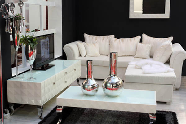
A monochrome room can look very elegant and stylish and is perfect for a dining room or bedroom. Vary the amount of black or white you use depending on how light the room is. Bedrooms can be darker their main use is at night after all whilst dining rooms tend to require a lighter atmosphere.
If photography is a hobby you may wish to look at the work of Ansell Adams as inspiration for decorating your black and white room. Create black and white photographs of still life objects or nature scenes to decorate a bare wall. Clean lines work well in a monochrome setting, so use ‘frameless’ glass photo frames and avoid fussy shapes. Instead add interest with contrasting textures such as fluffy cushions, silk sheets, Artex ceilings and staccato walls. Use lighting to your advantage too with a small crystal chandelier or light fitting to reflect the light around the room.
Another trick to stopping monochrome rooms looking bland is to use one bright color to add points of interest about the room; hot pink, gold, orange and sky blue work particularly well. Try the following:
- Put one large, bright pink cushion among a set of black and white ones and a matching robe hung on the back of the door.
- Use an orange border around slate grey walls, and match with a bright orange, oversized lamp shade.
- Use ‘dirty-gold’ or matt gold trimmings on things like curtain tie backs, raw stitching and drawer handles.
4. Variation on a theme using shades
Using shades creates a really exciting theme, particularly in a lounge or bedroom. Choose your favourite color then use the lightest or warmest shades as wall coverings, flooring and major furniture. Then using various tones and shades of the same color, add rugs, cushions, pictures, flowers and ornaments. In order to look more creative than mismatched, make your intention obvious with a piece of wall art depicting the color’s shades or create a hanging by stitching together various shades of fabric samples.
The main downside to using color shades is that you really limit yourself for future decoration; you have to really commit to just using this one color. If your daughter decides one day she doesn’t like pink, you have to replace everything! It also takes a very creative eye to get this right in the first place. You will probably find that day to day things naturally get moved about and this can distract from the overall design of the room. The colors have to feel right in the room as well as look right, otherwise the day you finish your interior design project will be the only one you find it stylish.


Leave a Reply